UX approach to an In-Destination app where information and up-selling need to live side by side.

TripBooster
Problem fInding
Once upon a time, TripBooster embarked on a transformative journey from its outdated design to a cutting-edge, user-centric experience that would redefine in-destination travel apps.
This adventure was marked by a commitment to elevating both the user experience (UX) and user interface (UI), all while targeting the competitive B2B2C market with a blend of emotion, commercial appeal, and seamless sales functionality.
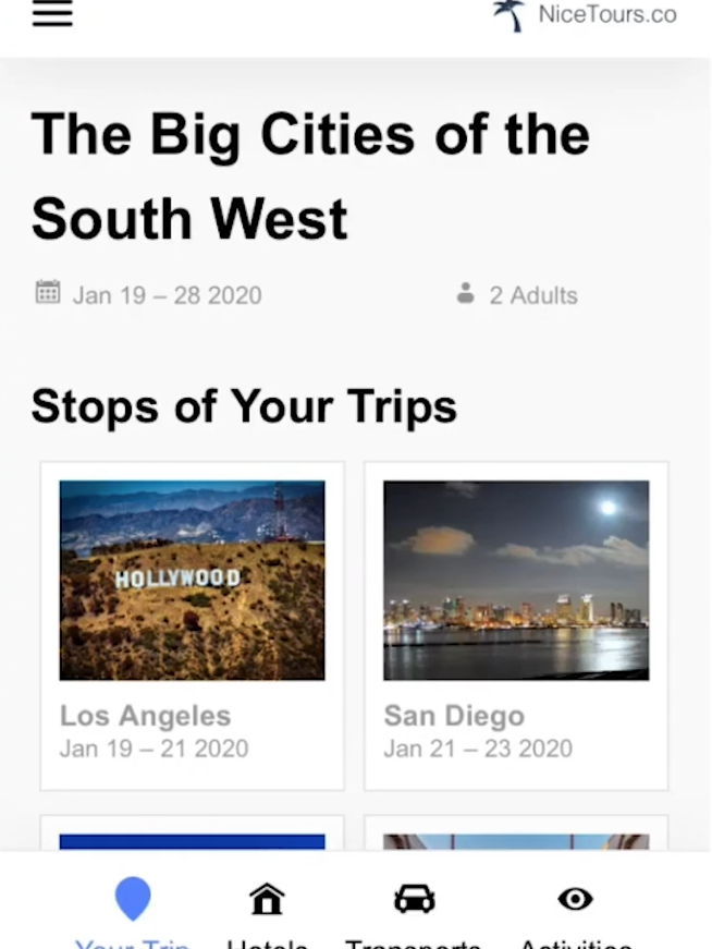

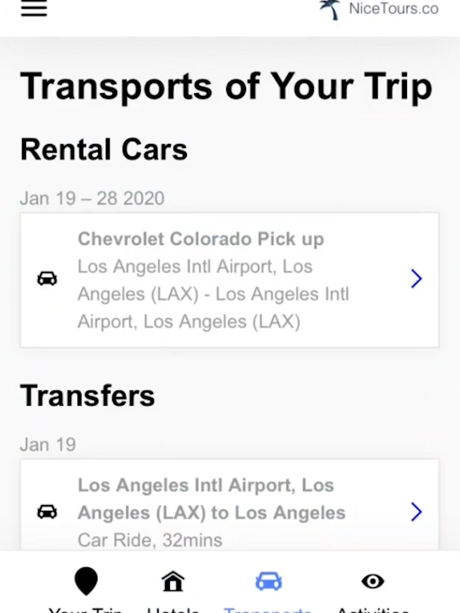
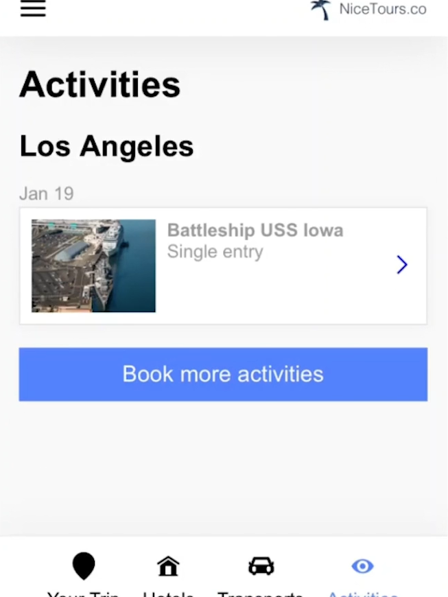
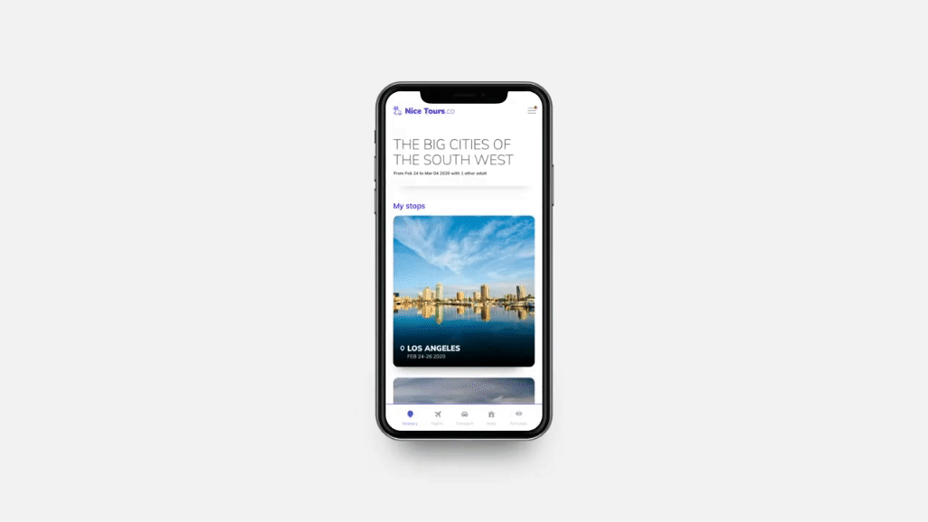
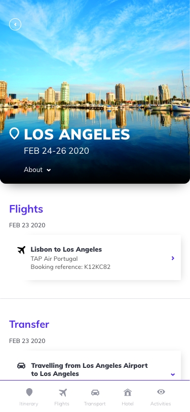
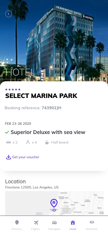
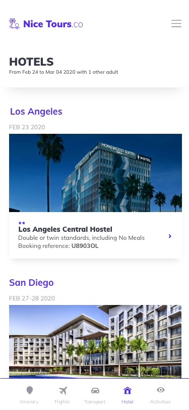
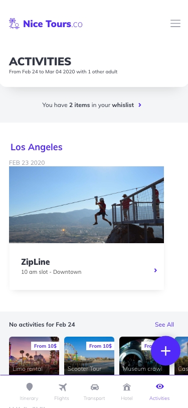
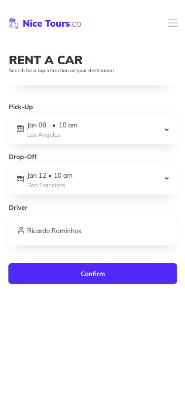
Unleashing a Seamless User-Centric Experience
As the design journey unfolded, the outdated elements of the old TripBooster were replaced with a fresh, modern aesthetic that placed the user at the forefront. The user interface was not just visually appealing but intuitively designed, ensuring that every interaction felt natural and guided.
Designing & delivering the things right
Recognizing the need for a delicate balance, the team dove into understanding the dynamics of the travel industry, identifying pain points, and envisioning a solution that seamlessly integrated into users’ journeys.
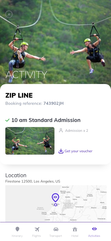


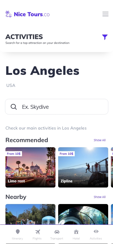
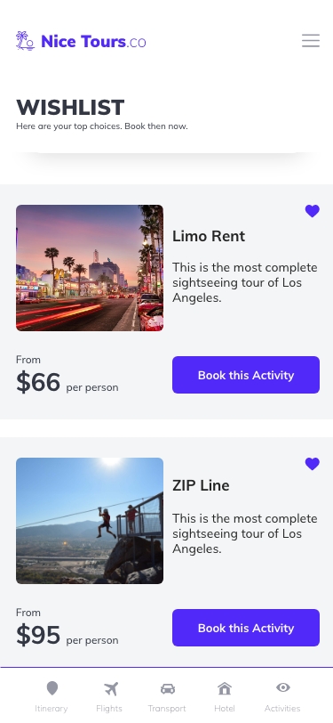
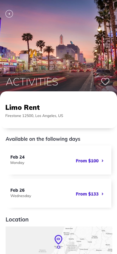


As the design journey unfolded, the outdated elements of the old TripBooster were replaced with a fresh, modern aesthetic that placed the user at the forefront. The user interface was not just visually appealing but intuitively designed, ensuring that every interaction felt natural and guided.
⸺ Positive User Feedback
Users appreciated the intuitive design, personalized recommendations, and the seamless transition between companion features and commercial offerings.
⸺ Customization Adoption
This high rate of customization not only showcased the flexibility of TripBooster but also translated into increased satisfaction among our business partners.
⸺ Global Reach and Adoption
The app's enhanced features resonated with diverse audiences, solidifying its position as a go-to travel companion and up-selling tool on a global scale.